
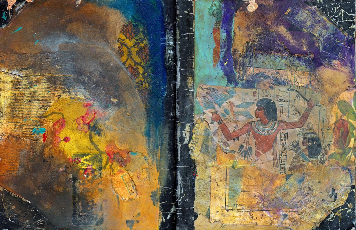

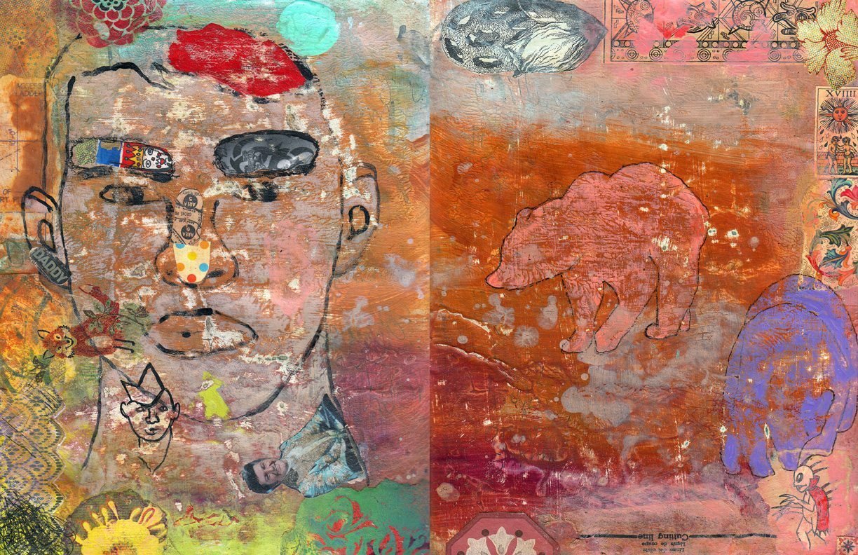
Spread 138 – Cover Story
17 August 2013
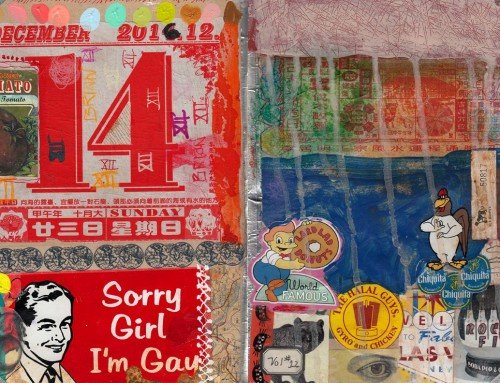
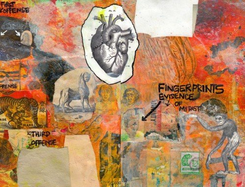
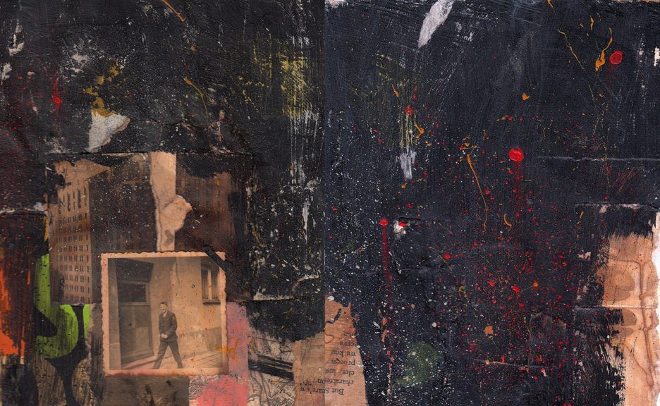
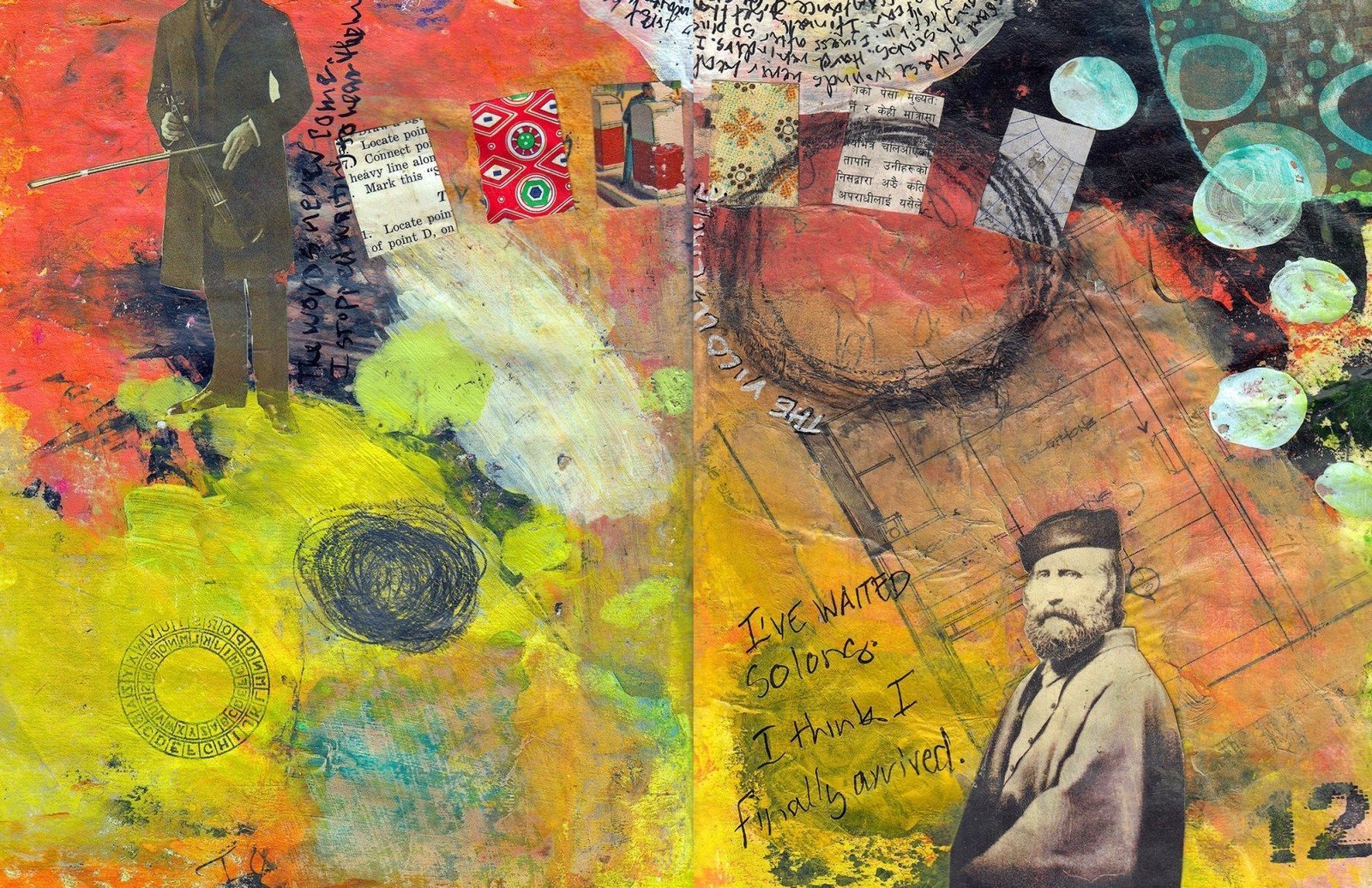
Vintage and personal papers, my hand made papers, metal tape, black gesso, matte medium, Nova color acrylic paint, Tim Holtz Distress Ink.
The covers for my art journals are as important to me as the art is inside the journal. They reflect a specific time in my life and evolve over the course of working in the journal. They change, they get grungy, and splattered, just the way I LOVE them. This one is just about perfect. It is just about me.
As always click on the image for a larger view.
This is one of my favorite things that you have done. Thanks for always sharing.
Love the contrasting colors and values, especially on the back cover, Brian. Amazing visual richness!
Yes, I would say rich too, and it’s so cool that you don’t neglect the cover, that you make it alluring. Nice to see that you’ve been busy.
XO
I just love all the colors and the textures. It looks like something you have and will treasure for years. So many interesting things to look at!
My first thought was of the color richness. Don’t you just love gesso and metal tape? Super!
This is incredible Brian- so very rich and the textures!
This is stunning Brian, so much depth and great colors 🙂
Love this cover! ancient, rich and deep….yummm
I actually inhaled deeply when I saw this. Such intense colours and so many layers – WOW!
Mighty impressive Brian. I really like the fact that there is so much to discover here.
i love that you say it’s just about you. it couldn’t be better when that’s the case. miss you. xo
[…] http://apaperbear.wordpress.com/2013/08/18/spread-138-cover-story/ […]